A Quick Look At The Art Grid
I thought I'd mention a video on how to set up grids under Krita,
as some artists seem to enjoy that.
The grid is a method of capturing correct proportions,
there is no debate about it.
Those who have tendencies to push artists away from art,
stir things up from time to time.
They don't matter as they are just full of hate and jealous,
and cannot be reasoned with.
There are some neat tricks related to the grid,
grid scaling, helps you enrage your source image.
And using apps that make the grid for you,
can really simplify the process.
You can try using chalk to make the grid,
so that you won't have to erase it using an eraser.
And of course, it is all really low tech,
and friendly.
The grid will take you a long way,
but you still need to worry about the shadows.
If your shapes are correct but light and shadow wrong,
the portrait still won't come out right.
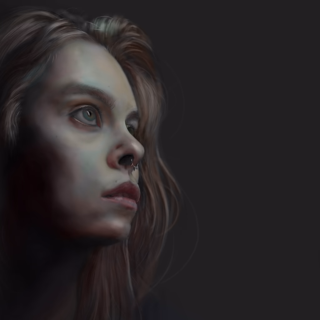
After all, the difference between a circle and sphere,
is just the shadow and highlight.
But having the correct proportions is a great start,
that will help you position everything else correctly.
To improve the shadow and highlight work,
make sure that your source image is black and white.
And try to use a mid tone paper,
it is art paper that is per-collored gray.
So you only need black and white chalk,
or a chalk pencil and your graphite.
But more than that,
try to apply the posterize filter to see colors a bit better.
And try an edge finding filter,
it will convent a photo to very rough outlines.
It maybe best to get into art on a computer,
as here you can erase and experiment to no end.
Paper or canvas,
is much less forgiving.
Beyond, correct proportions,
and getting the highlights and shadows correct.
Your next challenge will be color,
and on a computer you can study color with a color picker.
You can visualize how colors transform,
in sunset, or shadow, or even blue and stormy sky.
It is much easier to experiment with mixing your own colors,
and of course it does not cost anything.
There do exist color palettes that are more beautiful than reality,
for example, some portraits lit not just by light but also iridescence.
Magical colors, and thus color experiments are just as important,
as getting the proportions right.
And finally, the real critics, do not care about how you create art,
the critics worth their salt only care, that your art transforms lives.